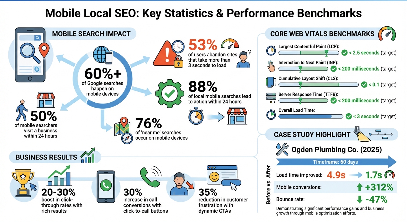
Mobile optimization isn’t optional anymore – it’s essential for local SEO success. With over 60% of Google searches happening on mobile and 88% of local mobile searches leading to action within 24 hours, your mobile site must perform flawlessly. Slow load times, poor navigation, or clunky design can cost you customers and hurt your rankings.
Here’s what you need to do:
- Use responsive design to ensure your site works seamlessly on any device.
- Improve page speed – 53% of users abandon sites that take more than 3 seconds to load.
- Incorporate location-based keywords like “plumber near me” to rank higher in local searches.
- Add local schema markup to help search engines understand your business details.
- Enable click-to-call buttons and maps for easy customer interaction.
- Test and monitor performance using tools like Google Search Console and PageSpeed Insights.
Your mobile site is often the first impression potential customers get – make it fast, functional, and easy to use. These changes not only improve your rankings but also drive real-world results, like calls, visits, and sales.
Mobile Local SEO Statistics and Performance Benchmarks
Use Responsive Design for Mobile Pages
What is Responsive Design?
Responsive design allows a website to adjust its layout and content seamlessly to fit any device, whether it’s a smartphone, tablet, or desktop. This is achieved through a combination of CSS3 media queries, fluid grids, and flexible images, all working together to serve the same HTML code across devices while adapting to varying screen sizes and orientations.
Google favors this method because it simplifies crawling and indexing. Instead of managing separate mobile subdomains or URLs, search engines only need to process one URL. With mobile-first indexing now the standard – where Google evaluates your site primarily based on its mobile version – responsive design is more important than ever. For local businesses, ensuring that critical information like your Name, Address, and Phone number (NAP) is easy to read and accessible without zooming or horizontal scrolling can significantly improve user experience and boost conversions.
“Responsive design ensures your website automatically adjusts to fit every screen size seamlessly. This adaptability ensures smooth navigation, readability, and overall usability, which critically influences your local SEO rankings.” – LocalMighty
How to Implement Responsive Design
To get started with responsive design, include the following meta tag in your HTML:
<meta name="viewport" content="width=device-width, initial-scale=1.0">
This ensures your page scales correctly to the device’s screen width. Next, use these techniques:
- Fluid grids: Design layouts using relative units like percentages so that elements adjust proportionally to the screen size.
- CSS media queries: Apply styles for different screen widths, such as
@media screen and (max-width: 420px) { … }, to tailor the appearance for smaller devices. - Scalable images: Use styles like
max-width: 100%;andheight: auto;to ensure images resize properly, or implement the HTML5<picture>element to serve device-specific images.
For usability, set touch targets (like buttons) to at least 44px by 44px to accommodate finger taps and prevent accidental clicks. Keep your font size at a minimum of 16px to ensure text remains readable on smaller screens. Finally, regularly test your design using tools like Google’s Mobile-Friendly Test or PageSpeed Insights. These tools help identify issues, such as improperly sized elements or spacing, so you can make necessary adjustments.
Once your responsive design is in place, focus on improving page load speed to further enhance your local SEO performance.
sbb-itb-3e387e1
Website Speed and Mobile Friendliness for SEO – Technical SEO Fundamentals
Improve Page Load Speed for Mobile
Mobile page speed plays a crucial role in both your local search rankings and how well you engage your customers. With Google’s mobile-first indexing, a sluggish site can push you down the rankings. And here’s the kicker: 53% of mobile users will abandon a page if it takes more than 3 seconds to load – so every second really does matter.
Page speed directly affects your visibility in Google’s Map Pack, where engagement signals like phone calls and requests for directions show how helpful your site is to local users. Google’s AI Overviews now prioritize fast, mobile-friendly content when referencing trusted local businesses. Take Ogden Plumbing Co., for example. In 2025, they teamed up with Advanced Local to improve their mobile load time from 4.9 seconds to 1.7 seconds. The results? A 312% increase in mobile conversions and a 47% drop in bounce rate within just 60 days. They’re now a go-to mention in Google’s AI Overviews for local plumbing queries. Beyond reducing bounce rates, faster load speeds can significantly boost your local SEO performance.
“Mobile SEO is a speed date with Google – you’ve got to load fast, look clean, and speak structured data. Remember, Google doesn’t rank mobile sites – it ranks mobile experiences.” – Kurt Fischman, Principal, Growth Marshal
To get started, you’ll need to test your page speed and identify areas for improvement.
Test Your Page Speed
Use Google PageSpeed Insights to assess your mobile performance. This tool gives you a score from 0 to 100 and offers detailed recommendations. Make sure to switch to “Mobile” mode to see how your site performs specifically on smartphones. It evaluates Core Web Vitals – such as Largest Contentful Paint (LCP), Interaction to Next Paint (INP), and Cumulative Layout Shift (CLS) – which are critical ranking factors.
For a more in-depth analysis, try GTmetrix, and don’t forget to check the Core Web Vitals report in Google Search Console. These tools will highlight issues like oversized images, slow server responses, or scripts that block rendering. Once you’ve identified the problems, it’s time to take action.
Methods to Increase Speed
- Optimize Images: Compress images with tools like TinyPNG or Tinify, and switch to formats like WebP or AVIF to cut file sizes without losing quality. Keep image widths under 1,200px and enable lazy loading (
loading="lazy") for images below the fold. - Minify Code: Remove unnecessary characters, spaces, and comments from your HTML, CSS, and JavaScript using tools like CSSNano or UglifyJS.
- Enable Browser Caching: Set “expires” headers for static resources, ideally for one year, so returning visitors don’t reload assets unnecessarily.
- Use a CDN: A Content Delivery Network helps serve content from servers closer to your users, cutting down on latency.
- Improve Server Response Time: Aim for a Time to First Byte (TTFB) under 200 milliseconds by upgrading to a high-quality VPS or cloud hosting plan.
- Limit Redirects and Third-Party Scripts: Avoid unnecessary HTTP redirects and reduce the use of heavy scripts like trackers, sliders, or auto-play videos, which can slow down rendering.
To achieve optimal performance, aim for a page load time under 3 seconds, with critical above-the-fold content loading in under 1 second.
| Metric | Target Benchmark | Impact on Local SEO |
|---|---|---|
| Load Time | < 3 Seconds | Retention and bounce rate |
| Largest Contentful Paint | < 2.5 Seconds | Perceived loading speed of main content |
| Interaction to Next Paint | ≤ 200 Milliseconds | Responsiveness to user interactions |
| Cumulative Layout Shift | < 0.1 | Visual stability and prevents misclicks |
| Server Response Time (TTFB) | < 200 Milliseconds | Faster rendering of above-the-fold content |
Use Location-Based Keywords
Once your site’s speed is optimized, it’s time to focus on content. Integrating location-based keywords is a powerful way to boost your visibility in local searches.
These keywords help search engines understand your relevance to a specific area. For example, phrases like “emergency plumber in Chicago” or “bakery near South Beach” signal to both Google and potential customers that your business serves a particular location. This is crucial, especially since a large portion of mobile searches have local intent.
Mobile users tend to search in a conversational tone, often asking questions like, “Where’s the nearest coffee shop open now?” With Google’s mobile-first indexing, your mobile site becomes the primary basis for rankings. This makes it essential to include the right local keywords on your mobile pages to appear in these searches.
“Keywords also play an important role in determining mobile user behavior. Mobile keywords are both conversational and transactional.” – Ruben Rogers, Digital Marketer, Local Ranking
The results speak for themselves. Take Milano Bakery in Joliet, IL, for instance. By optimizing for “joliet bakery”, they now rank #1 for that term. Their site attracts around 3,000 organic visits per month from desktop searches and ranks for 391 relevant keywords. Similarly, Kody Smith transformed a pet waste removal side hustle into a $300,000-a-year business by leveraging strategic local keywords – without spending a dime on ads.
Research Local Keywords
Start by brainstorming your core services and pairing them with local modifiers. Think about the neighborhoods, landmarks, or street names your customers mention. For example, a bakery in San Francisco might target terms like “bakery near Union Square” or “pastries in Nob Hill” instead of the generic “San Francisco bakery.”
Tools like Google Keyword Planner can help you identify high-volume terms. You can also type your keywords into Google to explore autocomplete suggestions and the “People Also Ask” section. Reviewing your Google Business Profile’s “Searches Breakdown” can also reveal the queries that led to your listing.
For local SEO, it’s smart to target a variety of keyword types:
- Explicit keywords: These include specific city names, like “Thai restaurant San Francisco.”
- Implicit keywords: Phrases like “near me” or “open now” capture immediate, location-based searches.
- Service + location combinations: These connect what you offer with where you’re located, such as “water heater repair Edmonton.”
| Keyword Type | Example | Purpose |
|---|---|---|
| Explicit | “Thai restaurant San Francisco” | Targets users searching for a specific city |
| Implicit | “Emergency plumber near me” | Captures immediate, location-based needs |
| Service + Location | “Water heater repair Edmonton” | Links a specific service to a local area |
Pay attention to the language your customers use when they call or interact with staff. This can help you capture regional vocabulary, which enhances authenticity for both search engines and your audience.
Where to Place Keywords
Once you’ve identified the right keywords, it’s all about placement. Strategically position them across your mobile pages to optimize visibility:
- Title tags: Include primary service and city names, keeping them under 60 characters to avoid being cut off on mobile devices. For instance: “Emergency Plumbing in Dallas | 24/7 Service.”
- Meta descriptions: Use secondary keywords and a clear call-to-action, keeping it under 105 characters for mobile display.
- Headers: Add local variations, like “Emergency Plumbing Services in Downtown Dallas”.
- Image alt tags: Use descriptive text such as “storefront of [Business Name] in [Neighborhood]” to improve image search visibility and accessibility.
- Body content: Naturally integrate keywords, especially in the opening lines, to grab attention and engage users.
Avoid overloading your content with keywords, as it can make your writing feel unnatural and may result in penalties from search engines.
“The more effort you put into proper optimization, the stronger a signal you will send to both the public and search engines that the local brand you’re marketing can meet specific needs within a specific geography.” – Miriam Ellis, Local Search Columnist, Search Engine Land
Keep refining your content and track its performance to ensure it continues meeting both user expectations and search engine requirements.
Improve Mobile Navigation and Readability
Speed and responsive design are just the beginning when it comes to winning over mobile users. User-friendly navigation and readable content are just as important for turning local searches into actual visits or calls. Think about this: 88% of consumers who search for a local business on their mobile device either call or visit within 24 hours. If your site makes it hard to find basic info – like your phone number or business hours – you’re practically inviting them to check out your competitors instead. Once you’ve nailed speed and keyword optimization, the next big focus is making navigation effortless.
Build Clear Navigation
Most people navigate mobile websites with their thumbs, so design with that in mind. Placing your menu at the bottom of the screen makes it easier to access – this is a trend even browsers like Safari are embracing. Use large, thumb-friendly buttons (at least 44×44 pixels) to minimize accidental taps.
Keep your navigation simple. A clean hamburger menu or tab bar works well, saving screen space while keeping important sections within reach. Add jump links at the top of your page to let users skip directly to sections like “Hours”, “Reviews”, or “Directions.” And don’t forget a sticky “Call Now” or “Directions” button that stays visible as users scroll – this makes it easy for them to take action without hunting around.
Place your most important details – like hours, address, and contact options – front and center, either at the top of the page or in the main navigation. Avoid using intrusive pop-ups that block content, as these not only frustrate users but could also hurt your rankings with Google.
While clear navigation helps users find their way, readable content ensures they stay engaged.
Make Content Easy to Read
Mobile screens are small, so your content needs to be easy to scan. Stick to short paragraphs, use bullet points, and ensure your font size is at least 16px to avoid forcing users to zoom in.
A single-column layout works best for mobile, eliminating annoying horizontal scrolling. Use clear, descriptive headings to break up your content, and for lengthy sections, consider expandable (accordion) menus. These keep your pages tidy and prevent overwhelming readers with too much info at once.
“Core Web Vitals alongside a smooth user journey on every resolution represent the major principle of mobile search engine optimization.”
– Tez Ferguson, CEO, Xploited Media
Add Local Schema Markup
Once your mobile site is easy to navigate, the next step is making sure search engines can clearly understand your business information. This is where local schema markup comes in. It’s a structured data format (in JSON-LD) that communicates key details like your business name, address, phone number, hours, and more directly to search engines. Think of it as giving Google a cheat sheet about your business.
What is Local Schema Markup?
Rich results are enhanced search listings that showcase extras like star ratings, photos, price ranges, and hours of operation. These stand out in search results and are especially effective on smaller mobile screens. Businesses with rich results often experience a 20–30% boost in click-through rates compared to standard listings. On top of that, structured data powers tools like ChatGPT and voice assistants such as Siri, making your business information more accessible.
“LocalBusiness schema markup is like hiring a perfect translator – it converts your business details into Google’s native language, ensuring nothing gets lost in translation.”
– Sebastian Żarnowski, Co-founder & CEO, Localo
Ready to add schema markup? Here’s how to do it.
How to Add Schema Markup
Start with Google’s Structured Data Markup Helper. Open the tool, choose “Local Businesses”, and input the URL of the page that contains your business information – this could be your homepage or contact page. Highlight important elements like your address or phone number, then assign the appropriate tags from the dropdown menu. Once you’re done, click “Create HTML” to generate your JSON-LD code.
Next, copy that code and paste it into the <head> section of your website’s HTML. Use tools like Google’s Rich Results Test or the Schema Markup Validator to check for any syntax errors. Make sure your Name, Address, and Phone (NAP) information exactly matches what’s on your Google Business Profile. Also, choose the most specific business type available – like “Restaurant” or “Dentist” instead of the broader “LocalBusiness” – so Google can better categorize your services. Lastly, since Google uses mobile-first indexing, double-check that your schema markup is visible on both mobile and desktop versions of your site.
Add Click-to-Call and Maps Features
Once you’ve set up schema markup, the next step is to make it as easy as possible for mobile users to contact you or find your location. This is where click-to-call buttons and embedded maps come into play.
Add Click-to-Call Buttons
Click-to-call buttons turn your phone number into a tappable link, allowing users to connect with you instantly. Instead of copying and dialing your number, they just tap and call. Businesses that implement this feature often see up to a 30% boost in call conversions.
Here’s how to set it up: use the HTML format <a href="tel:+15555555555">Call Us</a>. Make sure to include the country code (like +1 for the U.S.) and avoid special characters such as dashes or parentheses. Position these buttons strategically – place them in your header, near service descriptions, or in a sticky bar at the bottom of the screen. To ensure users can tap easily, each button should be at least 44×44 pixels (some experts suggest 48×48 pixels for even better usability).
For added convenience, consider dynamic call-to-actions (CTAs). For instance, display “Call Now” during business hours, and switch to “Message Us” or a contact form when you’re closed. This simple tweak can reduce customer frustration by 35%.
While click-to-call buttons make contacting you effortless, integrating maps ensures users can find your location just as easily.
Embed Maps and Directions
Embedding a Google Map on your contact page helps users visualize your location without leaving your site. Take it a step further by making your address clickable, so it opens directly in Google Maps or Apple Maps for turn-by-turn directions. With 76% of “near me” searches happening on mobile devices, eliminating any extra steps between search and arrival is crucial.
To make navigation even clearer, add written directions alongside the map. Mention nearby landmarks like “one block north of City Park”, and include helpful details such as free parking, public transit options, or wheelchair accessibility. To keep your site running smoothly, use lazy loading for your embedded map so it only loads when users scroll to that section.
These features not only enhance the user experience but also make it easier for customers to reach you – whether by phone or in person.
Test and Monitor Mobile Performance
Once you’ve added click-to-call buttons and maps, it’s crucial to regularly test and monitor your mobile pages to ensure your updates are working as intended. Without consistent tracking, you can’t be sure if your changes are truly making a difference. By using the right tools and metrics, you can keep refining your mobile performance and stay ahead.
Tools for Mobile Testing
Start with Google Search Console’s Core Web Vitals Report. This tool uses real-world data from visitors to categorize your pages as “Poor”, “Need Improvement”, or “Good”. Begin by addressing the “Poor” URLs since they have the most significant impact on your rankings. After making updates, use the “Start Tracking” feature to open a 28-day monitoring window that confirms your fixes.
For more in-depth analysis, turn to PageSpeed Insights. This tool provides both field data (from actual users) and lab data (simulated testing), along with actionable recommendations like compressing images or eliminating unused scripts. You can also use Chrome Lighthouse through Chrome DevTools or the Google Mobile-Friendly Test to quickly identify issues such as small fonts or overly tight tap targets.
When optimizing, aim for these key benchmarks:
- Largest Contentful Paint (LCP): Under 2.5 seconds
- Interaction to Next Paint (INP): 200 milliseconds or less
- Cumulative Layout Shift (CLS): Below 0.1
Danielle Birriel, Founder of D&D SEO Services, emphasizes the importance of mobile optimization:
“Your business is being judged based on the mobile version of your site – not your desktop site”.
Track Local SEO Metrics
To evaluate the success of your mobile efforts, use Google Analytics to monitor metrics like bounce rates, session duration, and conversions. Create custom segments filtered by city or region to better understand local visitor behavior. In Google Search Console, apply filters for queries that include your city or “near me” to track how your mobile rankings shift over time.
Local engagement metrics are especially important. Keep an eye on click-to-call taps, direction requests, and map interactions. You can track these actions using Google Business Profile Insights, which provides data on mobile-driven activities directly from your map listing. Considering that 76% of “near me” searches occur on mobile devices and 50% of those users visit a business within 24 hours, these metrics offer a clear picture of how your mobile optimizations are impacting your local audience.
Conclusion
Making your mobile pages work for local SEO isn’t just a good idea – it’s how customers will find and choose your business. With mobile devices accounting for over 60% of all website traffic, your mobile site often serves as the first impression for potential customers.
The strategies we’ve covered create a mobile experience that boosts your local SEO efforts. Responsive design ensures your site looks great on any screen size, while fast page load times (ideally under 2.5 seconds) keep visitors engaged. Using location-based keywords and implementing local schema markup helps signal relevance to Google, increasing your chances of appearing in the Local Pack and Maps results. Features like click-to-call buttons and embedded maps make it easy for customers to take immediate action. In fact, 88% of people who search for local businesses on mobile either call or visit within 24 hours.
Mobile SEO isn’t just about having a mobile site – it’s about creating a fast, user-friendly experience packed with structured data. Your mobile site is often the key way for local customers to find and interact with your business.
To get started, test your mobile site’s performance with tools like Google Search Console or PageSpeed Insights. Focus on fixing the biggest issues first, whether it’s slow load times, clunky navigation, or missing local schema. Every improvement brings you closer to turning local mobile searches into actual customers. That smartphone in your customer’s hand could lead to your next sale – make sure your site is ready to meet their needs.
FAQs
How can I make sure my mobile site loads quickly for better local SEO?
To make sure your mobile site loads quickly, there are a few steps you can take. Start by compressing your images to reduce their file size and enable lazy loading for content that’s not immediately visible. This way, only the essential elements load upfront, saving time and data. Using a responsive design is also key – it adjusts your site to fit various screen sizes without needing separate mobile URLs.
Another important step is to cut down on unnecessary third-party scripts, as they can slow things down. Pair this with a reliable hosting option, such as VPS or cloud hosting, to keep your site running smoothly. Regularly check your site’s performance using tools like Google’s PageSpeed Insights. These audits can help pinpoint and fix any speed issues. A fast, mobile-friendly site does more than just improve user experience – it also gives your local SEO rankings a boost.
What are the best ways to use location-based keywords effectively?
To make the most of location-based keywords, start by pinpointing terms that tie directly to your business’s geographic area. Think city names, neighborhoods, or even nearby landmarks. Don’t overlook phrases like “near me” – these can be a magnet for local customers searching for services in your area.
Tools like Google Autocomplete and People Also Ask are great for uncovering popular local search terms. Once you’ve gathered your keywords, weave them into your content naturally. Include them in key places like page titles, headings, meta descriptions, and even on dedicated location-specific pages. This signals to search engines that your business is relevant to local searches, boosting your visibility and drawing in nearby customers.
By focusing on geo-targeted keywords and strategically placing them across your site, you’ll create stronger connections with your local audience and improve your chances of being found.
What’s the best way to use local schema markup for better local SEO?
To make the most of local schema markup, integrate structured data into your website that highlights essential details about your business – like your name, address, phone number, and operating hours. This makes it easier for search engines to understand your business and boosts your visibility in local search results, including Google Maps.
Choose the right schema type for your business, such as LocalBusiness, and make sure the information you include is accurate and up-to-date. Tools like schema validators can help you test your code to ensure everything is working smoothly. When implemented properly, local schema markup can improve your local SEO and help you attract more customers in your area.
Related Blog Posts
- Geo-Targeted Content for Local SEO Rankings
- Why is SEO Important for Home Service Businesses?
- How to Optimize Mobile Page Speed for SEO
- How To Fix Mobile LCP Issues